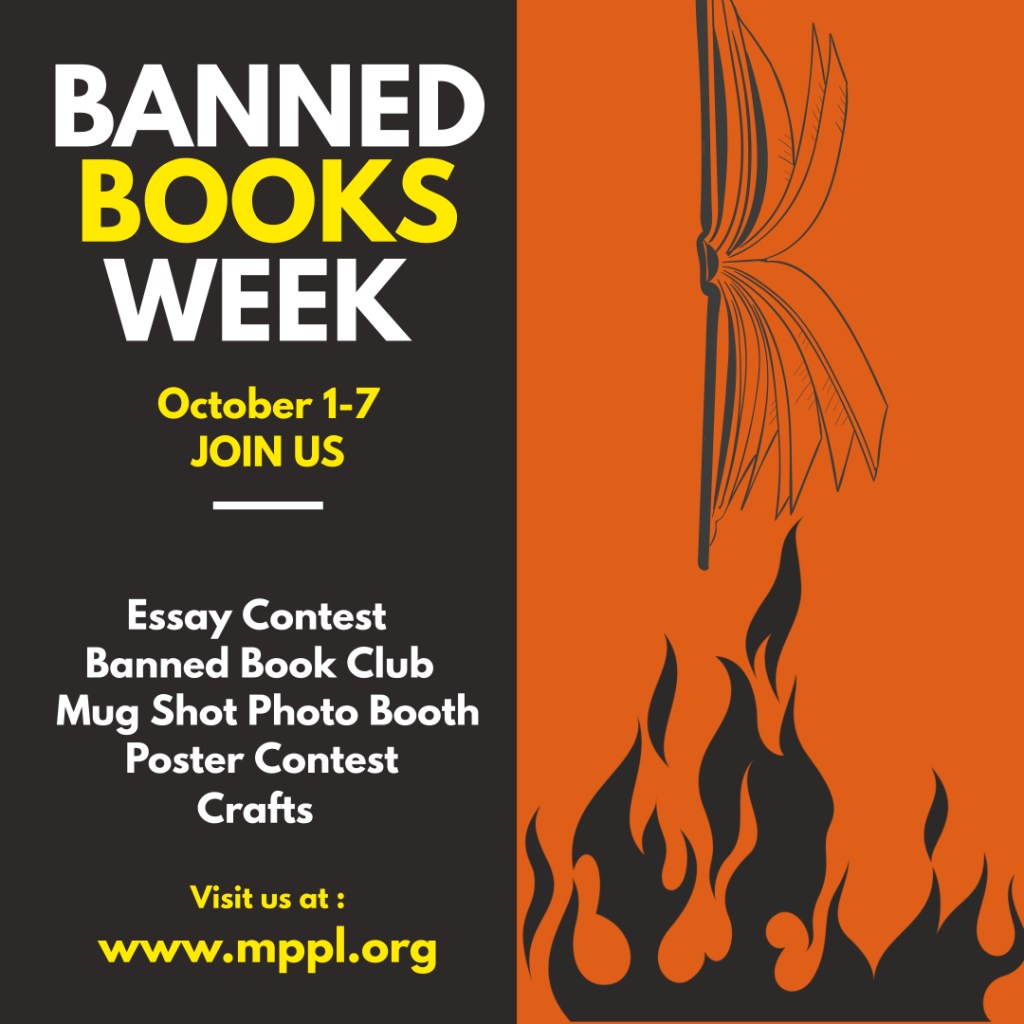
This week, we created mock-up advertisements for library events. I designed the Instagram post first. In The Non-Designer’s Design Book, Robin Williams said that warm colors attract attention. I chose orange for Banned Books Week because orange is usually used to indicate danger or warning. Traffic cones are an example of this. Orange is also a color of fire, which made me think of Fahrenheit 451. I chose an off-black to represent ash and to act as a contrast to orange. I chose yellow as an accent because yellow pops against black (contrast) and it is also a color of fire. While red is a color of fire too, I chose yellow because red would have been too close to orange to differentiate. It would have clashed a lot more.
I really liked the visual idea of burning a book to capture the ethos of Banned Book Week. Thinking about fire made me think about Johnathan Edward’s, “Sinners in the Hands of an Angry God,” sermon, where God is holding up a man’s soul over a pit of flames and He can cast the man into the flames at any second. That imagery inspired me to find some vectors that I could use to show a book being dangled above a fire. After finding some free vectors, I tilted the book on its side. I tried to align the book and the flames.
Next, I made the printable flyer. That was harder. One thing that I liked on the Instagram post was that when I centered the text, it made two very strong shapes, and combined, those shapes look like an exclamation point. This is another subliminal cue related to danger, warning, etc.
At first, because it worked so well on the Instagram post, I had all of my text centered on the flyer too. But then re-reading William’s book, I decided to have the Date and “call to action” left-justified, the weekly events be left justified, and “Banned Books Week” centered. These things helped me to create balance in alignment. The viewer’s eye easily can tell that there are three separate blocks on the page. Because there is a left, a right, and a center justification, it feels balanced. However, it doesn’t feel static because the blocks are different sizes and shapes.
I centered the “Banned Books Week,” text because that was in the same block that had two other visual elements, the flames and the book, that were aligned in the center.
I chose to make the steel drum garbage can both because it tied together with the Instagram post and because it was very easy to make just by using basic shapes. No extra vectors required.

Leave a reply to Michelle Cancel reply